


Bollinger Bonds
The Q4 countertrend rally in the Bond bear market over-extended an emerging bull trend in equities. Both short term moves are now correcting, while leaving their trends intact.

In our April monthly, we highlighted the combination of fading impulse for momentum stocks (principally tech) and the need for tax related selling in the trading/retail space coming against a background of a correction in the short term bull phase within the longer term bond bear market. Since the beginning of March, US 10 year yields have gone from 4% to around 4.6%, unwinding the Fed Pivot language that emerged to ‘explain’ the earlier rally. In our view that was an unlikely ex-post narrative, as is the one emerging now that the Fed will not cut at all.
Equities, having been over-extended by the Q4 counter-trend rally in bonds, have been dragged back in line.
The way that the pundits have chased from one extreme of the Fed ‘pivot’ and 6 or 8 rate cuts to none at all in the space of two months is reminiscent of watching 7 year olds play soccer
Bear within a bull? Or vice versa?
Many years ago, when I worked as a sell side Strategist, we had a Head of Sales who would constantly ask “Are we in an (equity) bull market yet?” Naturally he didn’t like the answer ‘No….and Yes’; it was the early 2000s and we had several short term bull phases against a medium term bear trend. People tend to like things to be binary, but if it was that easy you wouldn’t need a Strategist to try and makes sense of it all. Nor indeed a Head of Sales.
Our framework for understanding markets evolved in that period and is to segregate long-term investors, medium-term asset allocators and short-term traders, who all have different expected and targeted risk/return profiles and expectations and to use behavioural finance to assess their likely actions. Clearly, when all three are aligned, the market moves are most powerful, but frequently they pull in opposite directions. Our aim is thus to try and make sense of which group is dominant at any one time.
Broadly speaking, medium term prices display bear trends - as asset allocators sell the rallies - or bull trends -as they buy the dips. Meanwhile, shorter term market prices display either momentum or mean reversion as leveraged traders do the same. As such a medium term bull trend - as we believe we now have in equities - can run ahead of itself as traders chase momentum - before reversing to the trending mean as the traders first stop buying, then try selling. Equally a medium term bear trend - as we believe we remain in in Bonds - can do something similar.
We believe that the mean reversion in Bonds that began in Q4 was a rally within a bear market, which fuelled momentum buying in equities as they were establishing a new bull trend. This in turn generated a narrative to match about Fed Pivots. Now that the countertrend bond rally has failed, things are not only reverting to the mean, but over-shooting and, once again, the narrative has reversed and indeed overshot in order to ‘explain’ things.
Using Bollinger Bands to describe as much as to predict
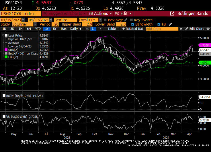
The chart in the header is what is known as a Bollinger Band chart of the US 10 year bond yield. Bollinger bands are a useful trading tool, but are also a helpful way for non traders to understand trading behaviours. Essentially they take a trending moving average and place lines +or - 1 Standard Deviation (magenta and green respectively) on either side of it. The underlying trading theory is based around probability of mean reversion; if a price breaks out of the band and then breaks back in, then the probability of reverting to the mean increases. The key is the part in italics, the price needs to start the mean reversion; otherwise overbought or oversold positions can just become more so.
If we look at the charts, we can see how in early April, the 10 year bond yield broke out through the top of the band, just as it had in mid January and early February. In the lower chart, this is more easily seen as where the line moves above 1. We can also see from the middle chart how the band itself moves between 5% and 16% in width, meaning that from the top, or bottom of the band to the middle is generally around a 5-8% move; not enough for investors to be too concerned, but obviously very much more important for a leveraged trading position.
A long term investor or an asset allocator can ignore a 5% move from the top to the middle of a band. A leveraged trader can not
Thus we see, that, as discussed two weeks ago, the US 10 year bond yield, which had been steadily rising since early January (re-establishing its bear trend) broke up to the top of the band but has since broken back in just as everyone stressed about rates. As is often the case, the narrative changed to justify the move and just when it was the loudest and the most compelling, the price switched the other way. The trend line for the yield, which is still rising and thus bearish, is a little under 4.5% at the moment, which is close to ‘normal’.
So, following the theory, the bond yield overshot to the upside, triggering lots of noise from traders and anxiety from asset allocators, before breaking back in and is currently reverting to the mean, which is why the noise has died down In price, rather than yield, terms, TLT, the ETF of the US long bond broke out the bottom of its declining band, before breaking back in, increasing the probability of mean reversal. And yes, in case you were wondering, Nvida just did the same thing as well.
Trends and counter-trends, rallies that are sold or dips that are bought. In hindsight it is all obvious, the important thing for longer tern investors is not to get caught up in the noise.